Fintech
Redesign a Data Dashboard
This project transformed a static page with an overload of data to a more sophisticated and appealing way to display many evolving data points.


Challenge
The monitoring platform had a very lengthy and cluttered interface, making it difficult for users to understand and digest the data. Visual graphics were not effectively communicating results and were leaving users confused on its representation. The data was also statically rendered and manually updated.
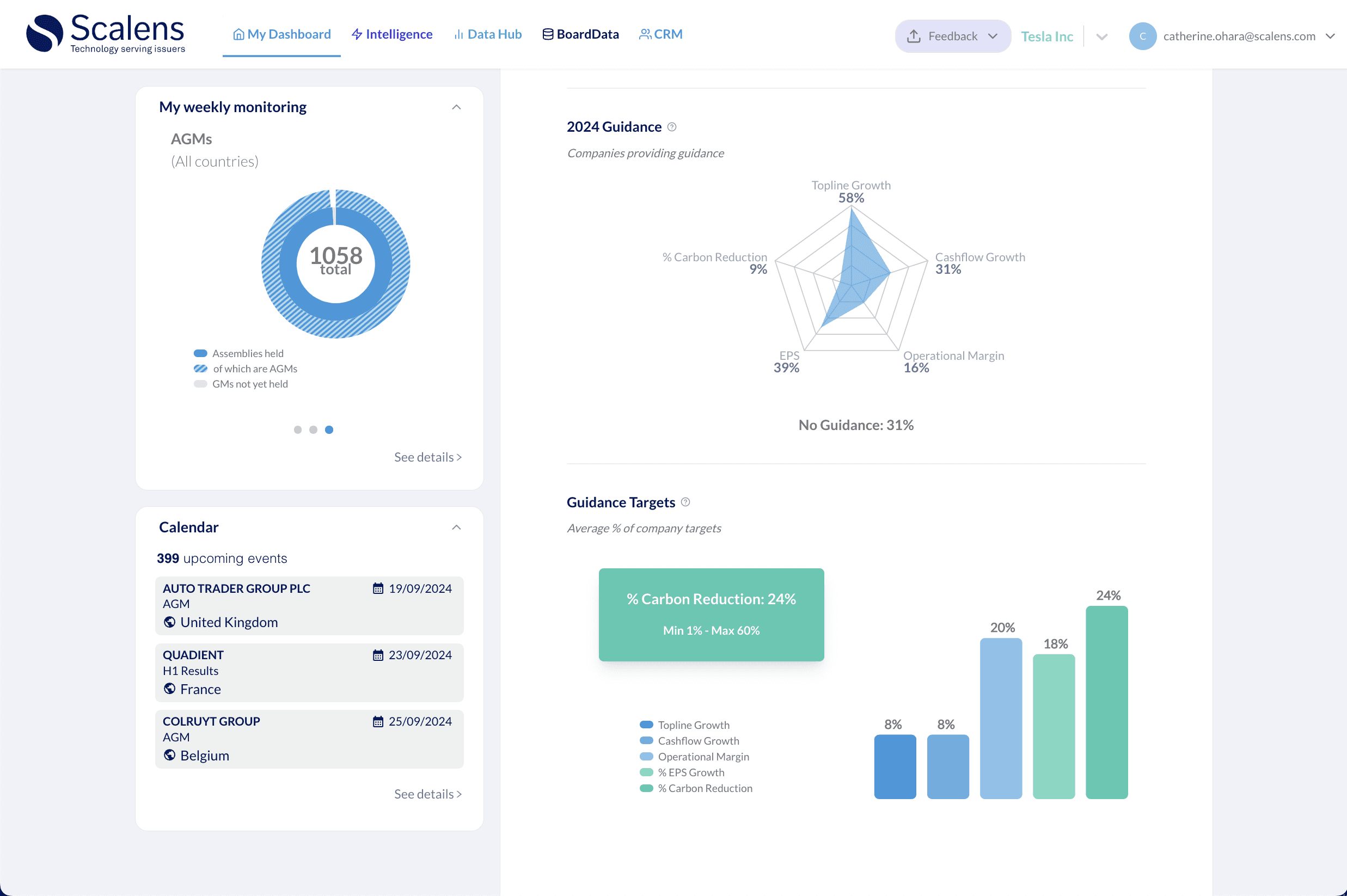
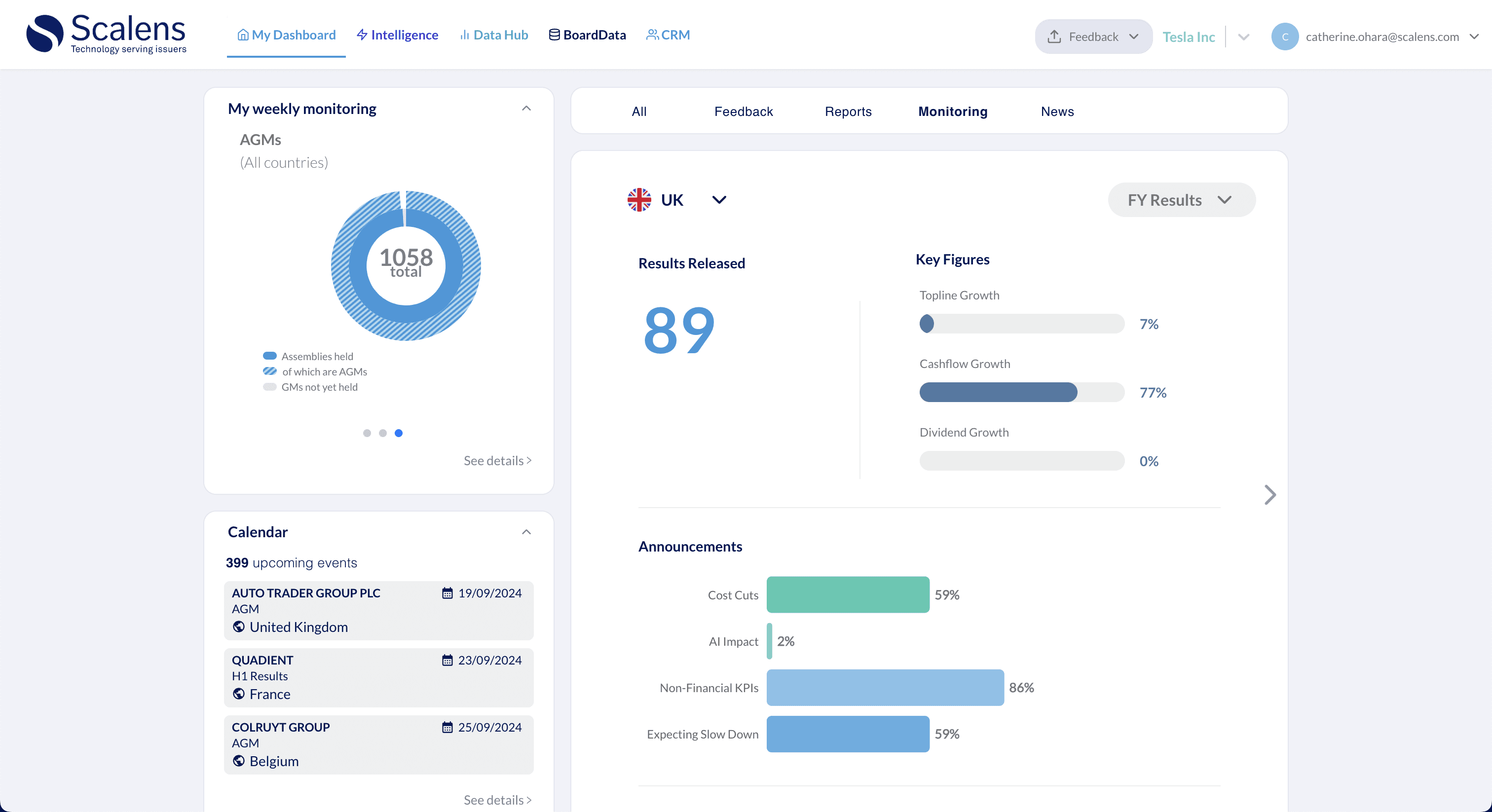
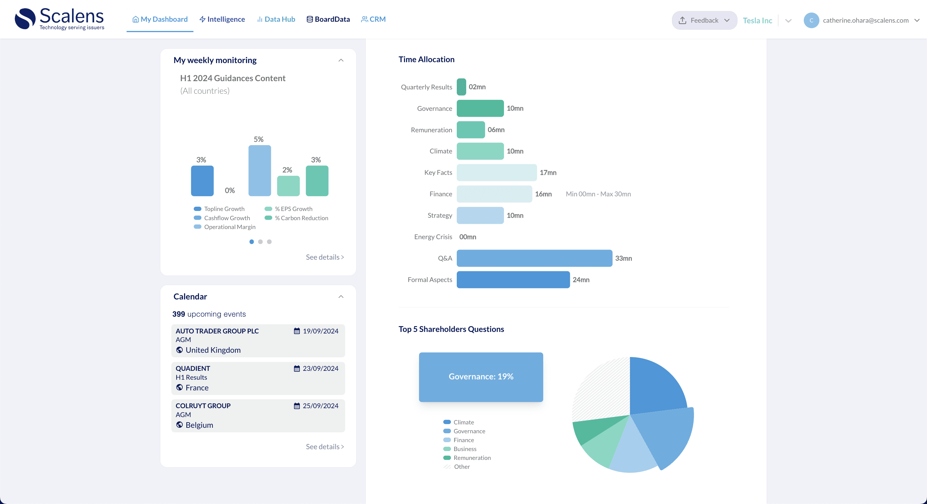
Results
The redesigned dashboard features a clean and organized interface, making it easier for users to navigate to the data of interest. The platform is now interactive on touch screens and monitors, and the interface is dynamically updated—saving a lot of development and company time. The graphics are more visually appealing and aligned with the company's goal of modernizing the interface. The page is responsive to various screen sizes and is accessible, allowing for keyboard navigation.